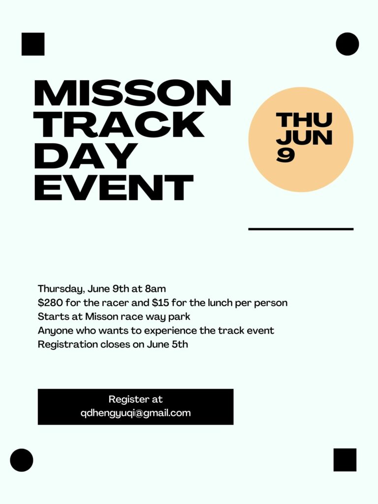
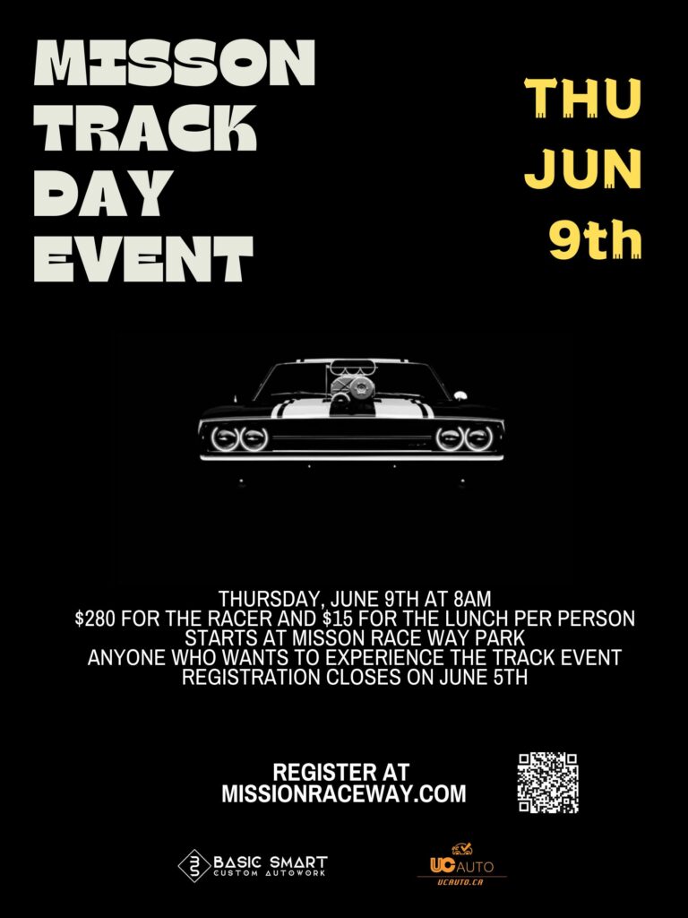
Last week I used Canva to design a poster about track events, but as I learned about multimedia design, I think that the poster I designed before has a lot of defects, so in this assignment, I changed some details in the poster.
The poster I created before:

After changed the poster:

Firstly, my poster theme is about track. I think the background color I chose before does not relate to my theme. So, I changed the background color of the poster in the new one, because colors can represent different meanings. Black is for power, it is related to the theme of the poster.
Secondly, I changed the font of the poster. I think in the posters I designed before, I used the same font that does not show people what the poster is trying to say. By learning the Adobe 14 creative poster ideas for design inspirations, I noticed that a good poster design should not only be the color but also with some different and novel fonts of the theme. At the same time, it can also allow people to distinguish when they view the poster. So in my new poster, I used different fonts to highlight the theme of the event and the date of the event.
Thirdly, I also inserted a picture of the car in the poster. Because in my first poster, the theme was track events, but there wasn’t an eye-catching point in the poster that directly highlighted the theme. People who are interested in cars can be well attracted by inserting pictures of car elements, also I inserted the sponsor’s logo so that people will think the event is genuine and guaranteed.
Then, I have redistributed the layout of the poster. By watching Design and Layout with Canva in the class, I learned that it is not only about the colors and fonts of the design, but also about having a good layout for the content that you design. A good design layout allows people to have a clear understanding, I think having a good layout when designing a poster will also improve the quality of the poster. So in my revised poster, I also redesigned the poster layout, in order to improve the quality of the poster and give people a good impression.
Finally, when studying multimedia design in class, I learned that Limited-Capacity Assumption is very important in multimedia design, it is impossible for people to receive all the information in a limited place or time so I added a QR code to the second poster to let people view this event at different times. I think it also solves the problem that posters can’t show more information to people. When I studied multimedia design, I thought that interaction with people was also very important, people can know more about this event by scanning the QR code, so it can solve the questions that people might have.
Overall, the event mentioned in this poster is an event that I actually hosted, so all information mentioned in the poster is real. The first poster is very different with the second one, because I realized that I have a lot to improve in the first one, so in the second poster I try to use the design theory that I learned in class to make changes. In my second poster, I know there are still some problems that I should improve on, so I believe there is still have space for me to improve on multimedia design.
References:
Lundberg, A. (2021, November 10). Color meanings and the art of using color symbolism. 99designs. Retrieved June 12, 2022, from https://99designs.ca/blog/tips/color-meanings/
— 14 creative poster ideas for design inspirations | Adobe Express. (n.d.). Retrieved June 12, 2022, from https://www.adobe.com/express/discover/ideas/posters
— Johnson, D. K. (n.d.). Design and layout with CANVA – youtube. Retrieved June 12, 2022, from https://www.youtube.com/watch?v=g3pdyid7BjU
— Mayer, R. (2020, January 31). Principles of Multimedia Learning – Center for teaching and learning: Wiley education services. Center for Teaching and Learning | Wiley Education Services. Retrieved June 12, 2022, from https://ctl.wiley.com/principles-of-multimedia-learning/